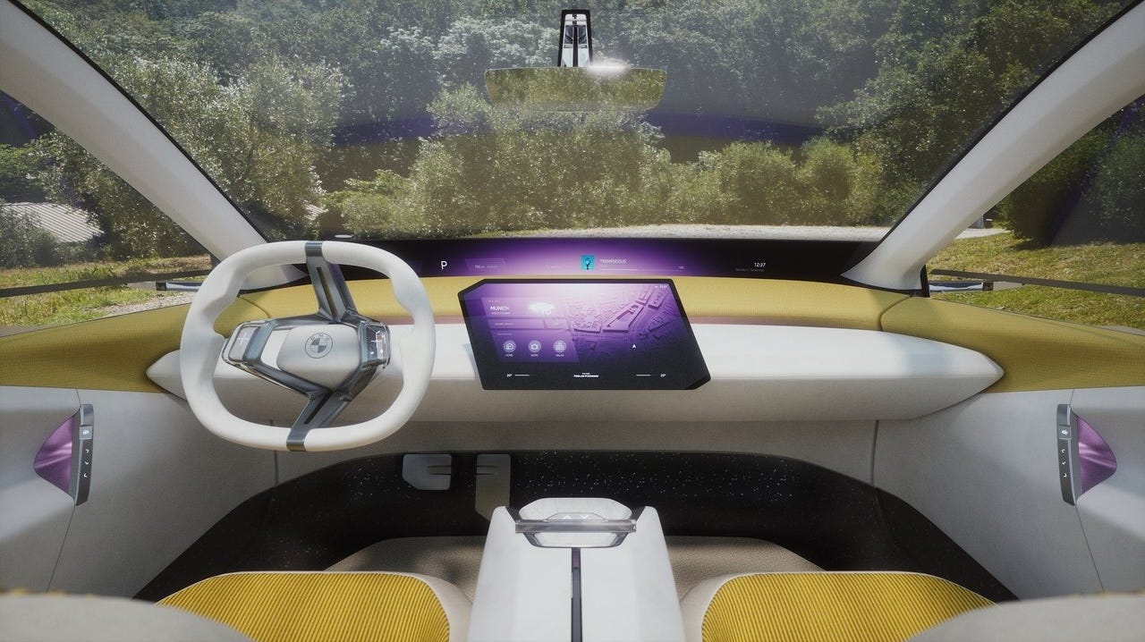
'Two-screen T-shape' interior design architecture
A fast emergent, novel interior design architecture for the mid-late 2020s (and beyond)
During the first half of the twentieth century, the interior of the car evolved from being machine-lead to being driver centric. By the start of the twenty-first century this had become a dominant design pattern defined by an instrument binnacle - housing the Instrument Cluster (IC) - that rose from the dashboard of Instrument Panel (IP), intersected by the Centre Cluster of secondary controls. Since then the Centre Cluster display has been replaced first with LCD radio screens, then small capacitive touchscreens, and most recently by large touchscreen displays that have provoked controversy with many HMI experts and road-testers voicing usability and driver distraction concerns.
Over the past 12 months a new HMI-lead interior design architecture has emerged that we describe as ‘Two screen, T shape’, defined by:
A large - typically landscape - central touchscreen display mounted at the front of the IP for both driver and front passenger to operate.
A shallow non-touch screen that runs full width at the base of the windscreen.

The first element of this architecture has been enabled by progressive market acceptance of one single touchscreen as the central user-interface, and the second by the EV lead shift in packaging that enables lower cowl points (if more so within the car than evident on the exterior) creating sufficient depth to package windscreen based screens. This new HMI design has several benefits:
It places driving relevant information directly into driver sight-lines and at optimal focal distances (unlike, for example, the Tesla format which requires the driver to constantly refer to the central display for basic driving information) and offers access to a greater level of technical assistance without distracting or becoming over bearing.
This configuration is uniquely adaptable from driving to stationary use cases - it aligns to the changing role of the vehicle as a space that can entertain us or be a place to relax in when the vehicle is not moving.
The placement of the two screens - the central touchscreen within reach of both driver and front passenger, and the out of reach windscreen base screen, are encouraging more sophisticated forms of I/O. Voice control is one obvious example, but inter-display interaction is a potentially greater opportunity. Today we perceive the single screen as a standalone device, and a UI design is constant to that one screen - with this architecture multiple screens work together in concerto to offer the customer the best experience in a specific moment (what content they show where and when).
This architecture has much scope to evolve further. By contrast, the single display HMI designs that have in recent years become so dominant are rather reductive; they limit the user experience and they are binary statements of a new tech derived identity that see themselves as the ‘right’ answer; they lack the ambition or scope to evolve further. Conversely, ‘Two screen, T shape’ can flex and adapt to different use cases and design themes, and evolve as technology progresses also (the windscreen base display could be replaced with projected displays that could vary its height/coverage depending on the use case, e.g. higher when stationary and watching a film in the car).
‘Two screen, T shape’ doesn’t pitch ‘design’ against ‘tech’ - it is perhaps the first architecture that balances both - and is all the better because of it. We think much of leading car designs of tomorrow will have this significant new interior design architecture.


